As an online marketer you know that it is important to run your website so that it is ‘Google Friendly’. This means keeping up with all the latest developments when it comes to updates and guidelines that Google has in place.
Mobile devices have been around for years and it is estimated that over 57% of your website visitors are viewing it on some type of mobile device. The increase of online shopping has also hit mobile and if your shopping cart isn’t mobile friendly you could be losing up to 30% of your potential sales!

From April 21st 2018 Google is using how mobile friendly your website is as a ranking signal. This is going to apply to all languages around the world. By doing this Google is aiming to deliver high quality search results to the user’s device.
What this means to you as a marketer, is that if your website isn’t mobile friendly then you are going to lose out on traffic. Additionally you will notice that your rankings in the search engines slide. Not what you want to happen for sure!
So what can you do about this?
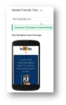
Well the simple answer is to ensure that your website is Mobile friendly. Not sure, use the following link to see how well your site ranks.
https://www.google.com/webmasters/tools/mobile-friendly
This is the result that you want to see:
How Searches Have Changed
One important factor of mobile marketing is to understand how the world of online searching has changed. Especially when it comes to local and offline marketing.
Do you remember years ago when you would enter a search time as follows?
Restaurant + Toronto
Dentists in New York
This isn’t necessary any more for mobile devices. As you search online your mobile device will automatically detect your location and provide you with local search results. You will need to turn on Location on your device for this to work.
Google’s update ‘Pigeon’ did a major revamp of how local search results were displayed. Instant local search results have helped both the mobile user and the business owner.
This means that if your business is listed in public review sites such as Trip Advisor your visibility will increase. Of course you need good reviews for this! To increase your presence list your business in as many local search directories as possible.
Understanding Mobile Users
Before we talk about how to ensure your website is mobile friendly you need to understand the habits and thinking of a mobile user. Yes, they are different to someone sitting at home on their Desktop computer.
The majority of mobile users say that they often make impulse purchases via their mobile devices. Which is why their shopping experience needs to be streamlined. If they get hung up during your checkout process, they may not complete the purchase when they get home.
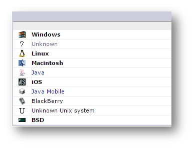
In a recent study 46% of users say that they browse the internet on their mobile device. Not sure how many web visitors are coming from mobile devices? Just check out your Awstats on your hosting account, as shown below.
Mobile users are out and about and this means that when they are looking for something they need it immediately. This is why your website needs to provide easy to find content that loads quickly and is easy to navigate.
It is now estimated that there are over 1 billion mobile users browsing the internet, and these numbers are rising. People are on the internet while sitting on the bus to work, while waiting in line at a checkout and even while watching TV at night. This means that your website could potentially see an increase in traffic just by being mobile friendly.
If a mobile user visits your website and has difficulty navigating your site, the chances they will return are very slim. They most likely will end up at your competitor’s website instead.
The Types of Mobile Layouts
There are three main types of mobile layouts and the good news is that Google views them all equally. Let’s take a look at each one.
Responsive Designs
This would be the type of layout that is considered standard for most webmasters today. The benefit to this type of design is that it will automatically detect what type of device is being used. The layout will then adjust the design to fit accordingly.
If you were to view your own website on your home computer and then on your smartphone or tablet you can easily see how the display changes.
A responsive design only requires one design and one URL. It is probably the easiest method for making your website mobile friendly. The biggest disadvantage to this design is that it has the potential to load more slowly. Even so it is still the most popular way to design your website for mobile.

Dynamic Content
With this type of layout you still only use one URL for your website. The biggest difference is that you are showing visitors a different version when they visit on a mobile device.
While this method is popular it takes more time to set up and maintain. The upside is that you can fine tune your mobile friendly layout to improve your visitor’s experience.
Mobile URLs
This type of layout is still worth mentioning, even though it is now considered to be out of date and old fashioned. This type of layout means you have to purchase a new URL for the mobile version of your site. You end up with two separate sites that will need to be maintained. A lot of extra work.
When a mobile user loads your site they automatically get redirected to the correct version, URL, of your website. This redirection must be set up correctly, which is not always that easy to accomplish.
Now let’s move on to how to make your current website friendlier for mobile users.
Making Your Website Responsive
The easiest way to make your current website responsive is by using a Responsive Theme. If you are using a site builder such as WordPress then you have lots of choices available.
Here are some top themes that are currently mobile responsive:
- Thrive Themes – http://thrivethemes.com/
- Studio Press Themes –http://my.studiopress.com/responsive-wordpress-themes/
- Theme Forest – http://themeforest.net/collections/3226617-responsive-wordpress-themesTheme Forest also has designs for HTML and Joomla based sites.
- Elegant Themes are another popular choice and they have 21 WordPress responsive themes available at the moment. http://www.elegantthemes.com/gallery/category/responsive/
- If you are looking for free themes, here’s a list of 30 designs. http://premium.wpmudev.org/blog/30-free-responsive-and-stunning-wordpress-themes/
- Then there are the themes from WordPress here: https://theme.wordpress.com/themes/features/responsive-layout/
If you haven’t updated your WordPress site lately, which you should get into the habit of doing, you may find that your theme is now mobile responsive.
To check for updates go to Appearances – Themes and see if an update is available. Or look at the top of your Dashboard and you will see a number beside the Updates available area.
Keeping Your Current Theme
If you really don’t want to change to a new theme it is possible to make it mobile friendly with a little help.
Jetpack helps site owners by giving you the mobile-friendly features of hosted wordpress.com with your self-hosted site.
WPTouch is a plugin solution that will help you create a separate, mobile-friendly version of your site. This will not affect your desktop theme, which will stay the same. When visitors view your site from any mobile device, your site will display with a different theme. You can select from various themes that the plugin offers. If you are trying to brand your business though, this may not be the best option.
WP Mobile Detector, this works in a similar way to the plugin above. You can select from different themes to create a mobile friendly version.
Please note that these themes have been designed to be about four times as fast as a regular site, so that they will load on a mobile device at super-fast speeds.
There are additional plugins available as well. Just do your research and read reviews before using.
Tips for Selecting Your Responsive Theme
Don’t allow not knowing if your theme is responsive or not to become a road block for you. As we mentioned before you can run it through Google’s Mobile Friendly checker. Or you can test it out in a different manner. This can be helpful if you are selecting a brand new theme and don’t want to start uploading each new theme and testing. Or you may not have access to a mobile device that you can use to test out the themes.
This process involves using the Emulation Mode from Google Chrome. To find this tool you need to be using Chrome. Then go to Menu – View Developer – Developer Tool
This article explains exactly how to use this:
https://developer.chrome.com/devtools/docs/device-mode
Another way to check if your site will load on a mobile device is by checking your Page load speed times. This can be done at the following link – a high score is a good indication that your site is responsive.
https://developers.google.com/speed/pagespeed/insights/
Differences Between a Desk Top and Mobile Home Page
When someone accesses your website at home on their Desktop they usually have a larger screen. This allows you, as the webmaster, to have more content on your home page. This includes more sales and promotional content.
For mobile users they are limited by what they can see. For this reason you want them to find what they are looking for quickly. Keep in mind too that mobile devices all have different screen sizes and this controls what each user will see.
What Mobile Users See
It is important to understand what mobile users see when they browse the internet. For example your website will display differently depending on whether they are using an iPhone, Smartphone. Laptop, Tablet or iPad. The layout of your page will depend upon the capability of each device. So two people with different Smartphones could view your content in a different manner.
Phones often display content in one column, whereas an iPad or tablet would display the content in two columns.
Responsive themes are displayed on mobile devices by using a navigation layout that comprises of the following main elements:
- App Bar
- Tab Bar
- Navigation Drawer
- Bottom Drawer

If you have all these elements in place then your visitors will beable to navigate your site and enjoy a good mobile experience. Meaning they will most likely return and that your conversion rates will also increase.
Checklist for a Mobile Friendly Site
Use the following checklist to see how friendly your website is right now.
Use a mobile device and load in your website, compare this to what you are seeing on your desktop computer at the same time.
- How fast/slow did the website load?
- Can you easily identify what your website is about?
- How well can the content be read?
- What’s it like to navigate?
- Can you find the call to action?
- How do you rate your experience as a user?
- Would you return to this site if it wasn’t yours?
- Is it easy to click on links?
- Is there lots of white space inbetween paragraphs?
You need to be really honest here. If your site didn’t perform well it is time to concentrate on getting it mobile friendly as soon as possible.
With the latest changes from Google it will really pay to have a mobile friendly website. For one your rankings could potentially be higher in the search engines, this equals more traffic and new customers.
At the same time giving your website a makeover will benefit your business by making navigating your site more pleasant. If people like what they see they will bookmark your site and return more often.
With the popularity of social media users will also Share, Like and Retweet your content providing you with more exposure.
The bottom line for your business is that you can’t fight technology and new developments in the online business world. Instead you must learn to accept them and integrate them into your business. Why stay outdated and possibly out of touch when you don’t have to?
Don’t Forget About Mobile Apps
One area that you don’t want to get left behind with is that of mobile applications or Apps as they are known. Some companies have developed Apps for their mobile users which have been designed to replace the user visiting any website. This is for ease of use and for loading and browsing purposes. It is thought that in the future websites will only be accessible from a home computer and from laptops.
There are certainly benefits to Apps.
- They are easy to use – all the user has to do is download and install it. Then fill in their details and they are ready to go. If you want to develop your own App then ensure that it is easy for people to enroll.
- Apps can be used as add-ons for your website. Facebook is a great example of this. It can be accessed by a user regardless of their location and what device they are using.
- Apps can save users time. Who isn’t busy these days and users are constantly on the move – what better way to stay connect than via an App. You are essentially taking your business to them!
- Apps allow you to capture data in real time. Business can now send out Tweets at a certain time to users in their vicinity. Think about how this can benefit restaurants for example.
What Does the Future Hold for Mobile Devices?
One thing you need to remember is that the world of mobile devices is forever changing. Just take a look at the types of wearable technology that are now available.
- Fitness trackers
- Cameras
- Portable Trackers
- Portable monitors and devices
- Smart watches
You have no doubt seen all the hype surrounding Apple’s Watch. Wearable devices is a trend that needs to be heeded.
So what does this mean for Google?
Of course, no-one can predict what Google will do when they release new algorithms. But one thing does seem to be clear and that is that local searches will become even more localised. Instead of displaying results in a general location, the results could be pinpointed to just a few blocks instead.

As a business with a website keep all of this in mind. Ensure that your website is responsive and mobile friendly. Make sure your visitors can easily click on links and navigate to other pages. Create pages that are easy to read with links that are clear and visible. Plus ensure that your shopping cart functions correctly on a mobile device.
By taking all of these steps you will have a modern business ready to handle customers from all across the country.